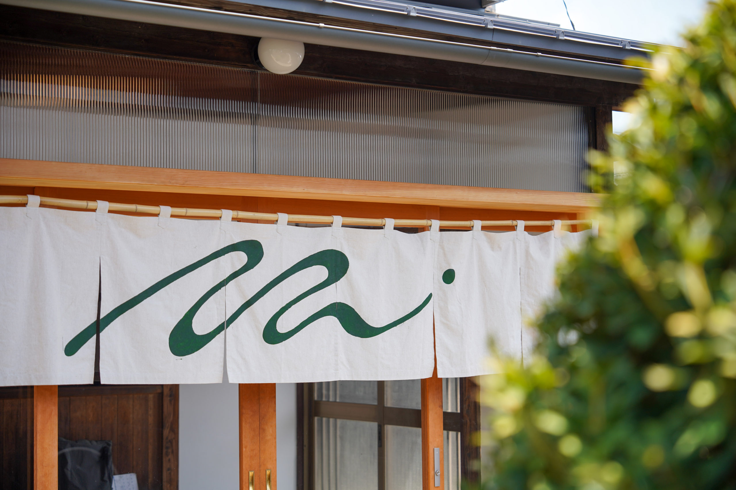
茨城県結城市で暮らすように滞在できる一棟貸しの宿HOTEL(TEN)のためのロゴマーク、暖簾、サイン、各種広報ツール。運営主体である一般社団法人MUSUBITOの母体となった結いプロジェクトでの10年の活動を経て生まれた滞在拠点。点が縁へと転じるようなTENとENと巡るキーワードを、点から生じる波や波紋のようにゆったりと伸びる一筆書きの「てん」のラインで表現。
client|一般社団法人MUSUBITO
art direction, graphic design|DIVE
https://hotelten.studio.site
![](https://divedesign.jp/wp-content/uploads/2024/05/ten_vi1-2-1400x933.png)
![](https://divedesign.jp/wp-content/uploads/2024/05/ten_vi3-2-1400x933.png)
![](https://divedesign.jp/wp-content/uploads/2024/05/A7C03887-1400x933.jpg)
![](https://divedesign.jp/wp-content/uploads/2024/05/ten_web2-1400x933.jpg)
![](https://divedesign.jp/wp-content/uploads/2024/05/ten_okami_flyer2-1400x933.jpg)
![](https://divedesign.jp/wp-content/uploads/2024/05/ten_banner3-1400x933.jpg)
![](https://divedesign.jp/wp-content/uploads/2024/05/ten_banner2-1400x933.jpg)